The menu of Het Koetshuis is more than a list of dishes. It is a brand touchpoint that every single guest holds in their hands. I designed it to feel consistent with the new visual identity, while applying the principles of effective menu design to guide the reader naturally towards the right choices.
Scope
Client
Duration
Year
/
Challenge
(01)
The most-read document in the restaurant.
A menu is not just a price list. It is arguably the most important piece of print in any restaurant. Every guest picks it up, reads it, and makes decisions based on how it looks and how it is structured. A poorly designed menu creates hesitation. A well-designed one builds appetite, communicates the character of the place and steers guests towards dishes that work well for the kitchen and the margin.
For Het Koetshuis, the menu also had to carry the new brand identity. The typography, the colour palette, the tone of voice: everything had to feel like a natural extension of the visual world we had built, from the logo to the signage.


/
Solution
(02)
Structure, hierarchy and a warm finish.
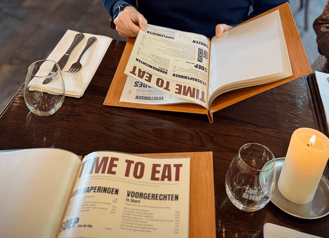
Good menu design is built on hierarchy. The eye needs to be guided. The most striking element of the Het Koetshuis menu is the category headers. Bold, oversized and set in Anton, they dominate the page in a way that is impossible to miss. In a busy restaurant environment, a guest scanning a menu needs to locate sections instantly. Large, high-contrast headers do exactly that. They act as anchors, organising the page into clear zones before the reader has even consciously started reading.
From those bold headers, the hierarchy steps down deliberately. Item names and prices sit in a lighter weight, descriptions and sub-notes drop further in size and shift to italic. Each level signals its own importance without competing with the others. The reading flow feels natural because the structure does the work quietly underneath.
Colour reinforces the hierarchy further. The deep terracotta red from the brand palette is reserved for the highest-priority categories, drawing the eye to key sections without overpowering the page. The softyellow background keeps everything readable and in keeping with the rustic, heritage atmosphere of the brasserie.
Layout plays an equally important role. Research consistently shows that guests spend less than two minutes reading a menu. That means clarity is not optional. Items are grouped logically, white space is used to prevent visual fatigue, and the most important sections are positioned where the eye naturally lands first.
The result is a menu that feels warm and handcrafted, consistent with the overall brand, and easy to navigate for every type of guest.
/
CONCLUSION
(03)
Design that works while you eat.
Menu design is one of those disciplines that goes unnoticed when it is done well. Guests do not think about typography or hierarchy. They just find what they are looking for quickly, feel good about the place they are sitting in, and order with confidence. That invisible quality is exactly what good graphic design should achieve. It is a small piece of work with a big daily impact. This project was realised during my time at XXLSIGN, where I took full creative ownership of the design from concept to final delivery.
Latest Projects.
© Ellevated
A curated selection of projects that reflect our commitment to simplicity and purposeful design.