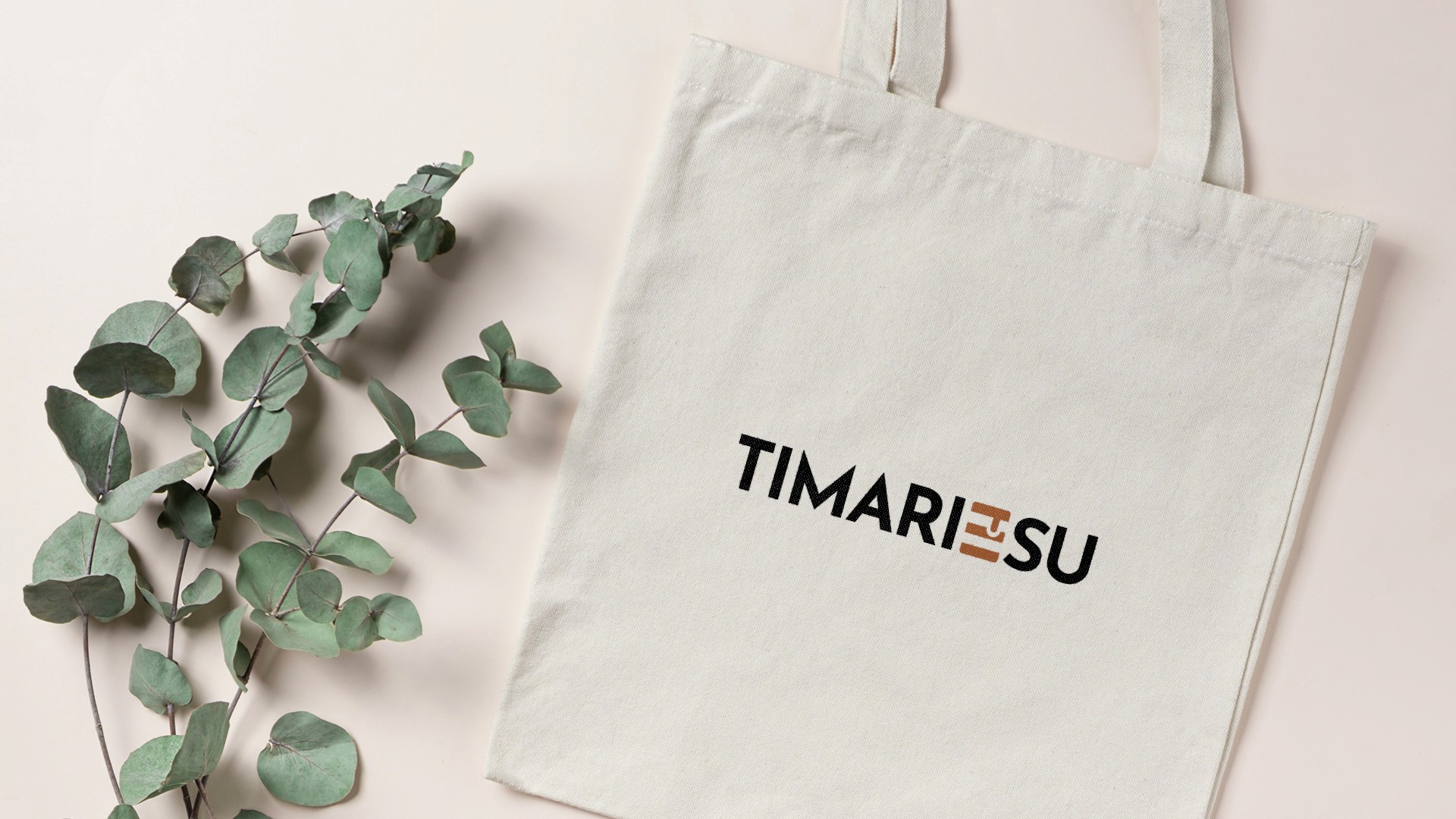
Ti Marie Su is the personal brand of Marie Monballiu, a Flemish media professional working both in front of and behind the camera as a producer, editor and voice-over artist. I designed a logo that captured the layered nature of her work, and the playful nod to her favourite dessert.
Scope
Client
Duration
Year

/
Challenge
(01)
A personal brand for someone who does it all.
Marie works across production, editorial, presenting and voice-over. She understands both sides of a camera, which makes her unusually versatile in the Flemish media world. But that versatility was exactly the challenge: how do you distil all of that into a single logo that is simple, memorable and still says something?
The name was already there and it told a story. Timarisu refers both to her favourite dessert, made from her mother's recipe, and to the different layers of her professional life. The logo had to honour that story without overcomplicating it.
/
Solution
(02)
Three layers, one mark.
The direction was clear from the briefing: minimalist, playful, clean. Marie had a strong sense of what she did not want. Nothing too busy, nothing too corporate, nothing that felt like it was trying too hard.
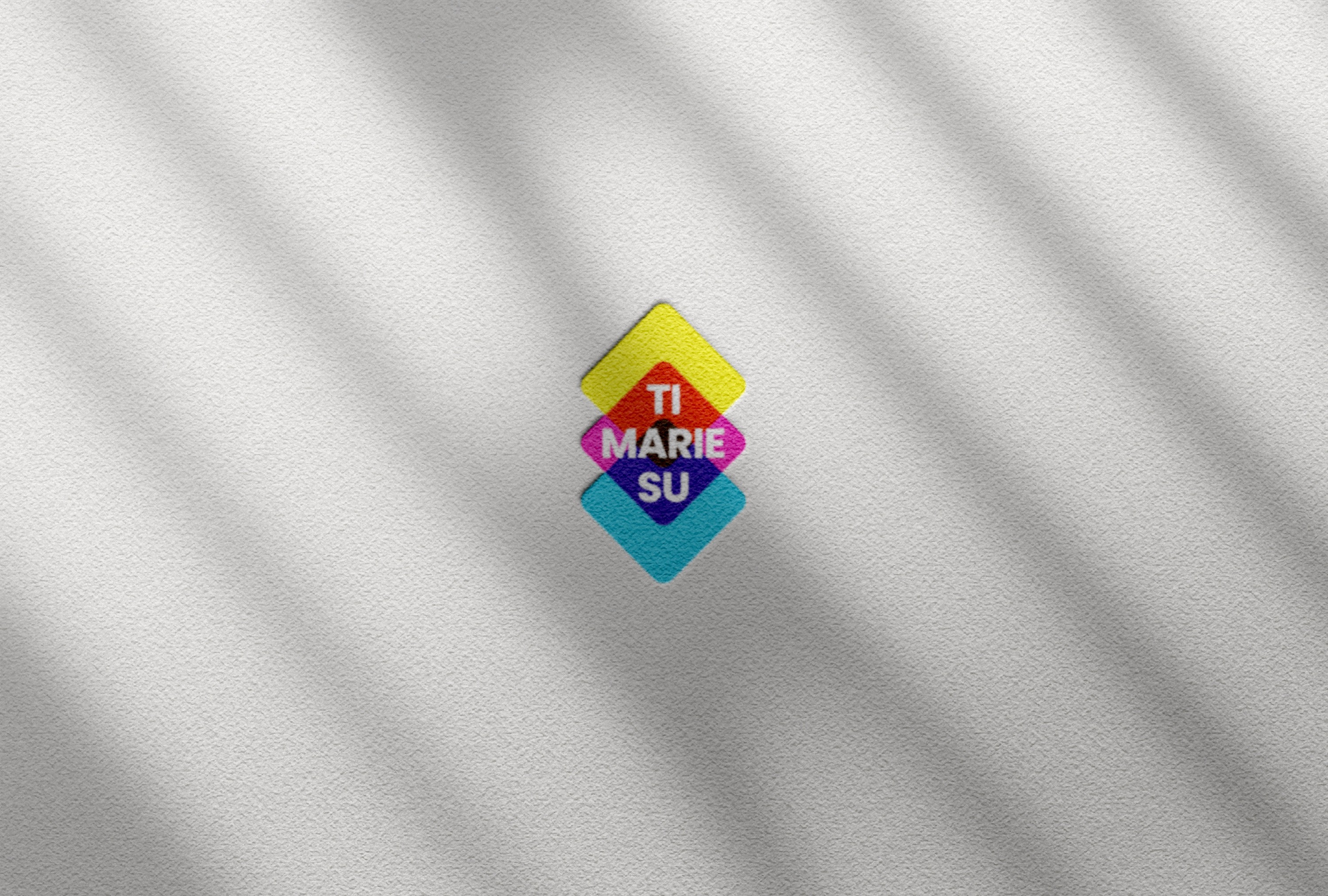
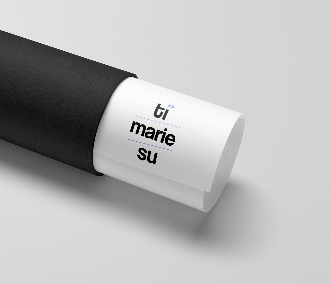
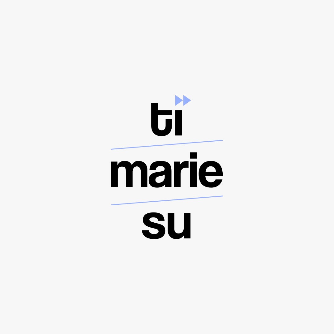
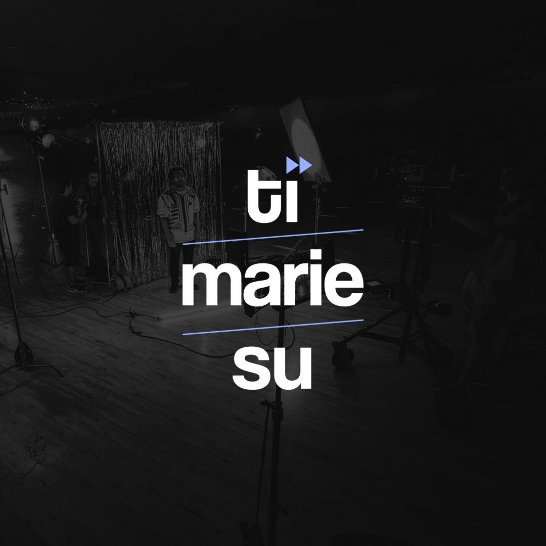
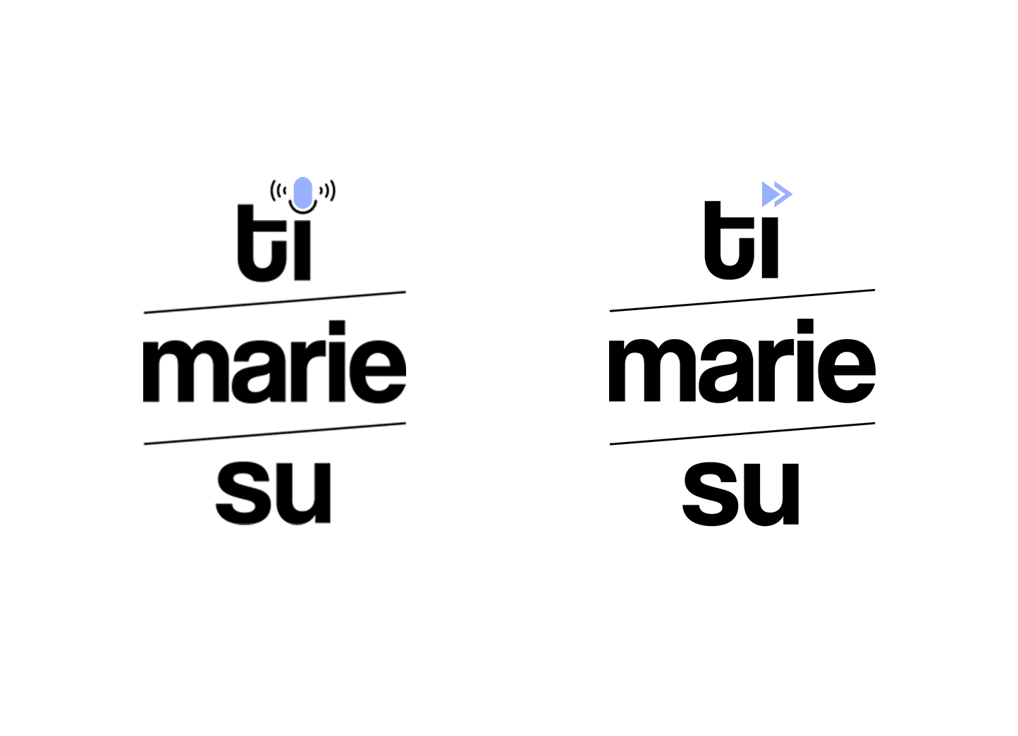
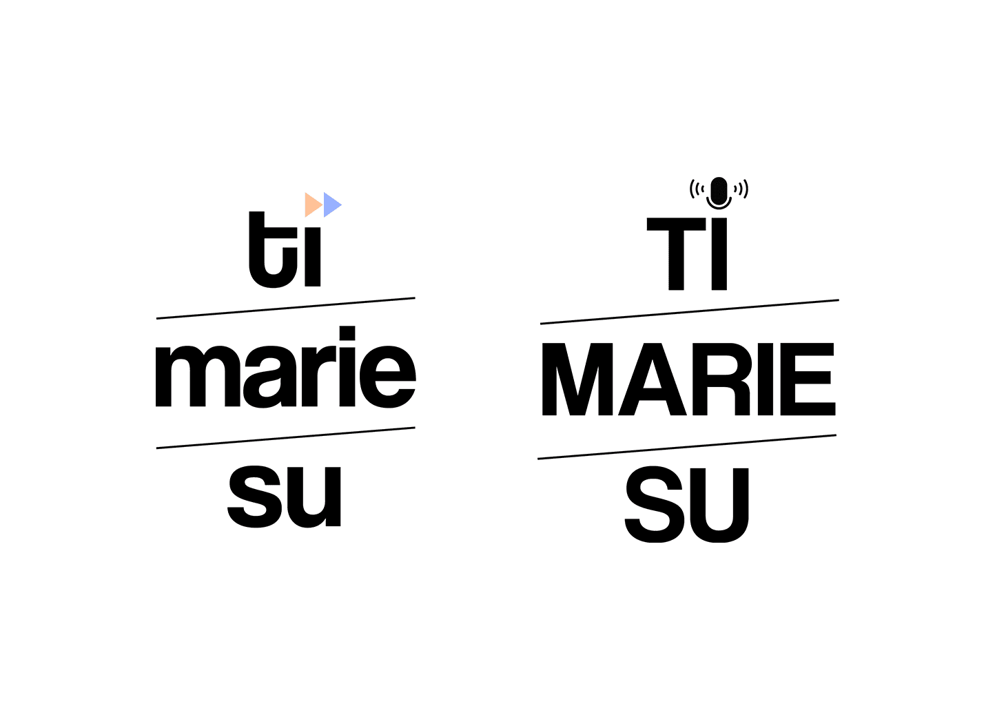
I built the logo around the three layers of her name: ti, marie, su. Stacked, readable and structured, with a fine and elegant typeface that felt professional without being stiff. The finishing touch was the dot on the i. A small icon drawn from the media world: the play button. Recognisable, clever and tied directly to her sector without spelling it out.
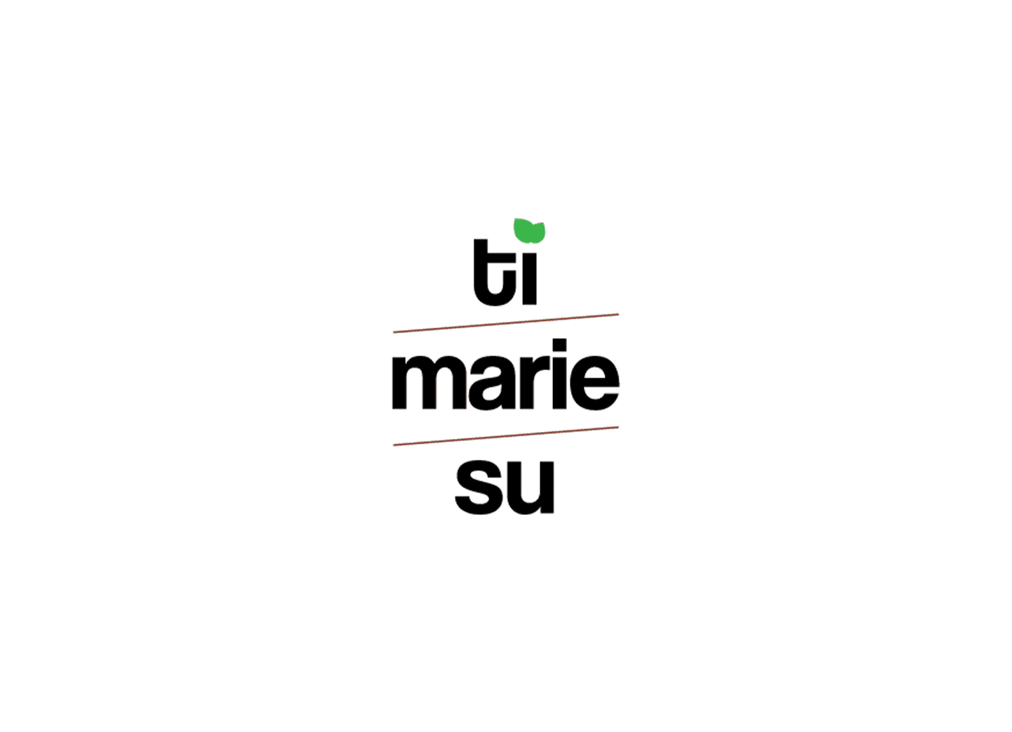
That dot took time. We went through multiple shapes and colour variations before it felt exactly right. Small details like that matter in a logo because they carry a lot of weight. The final result was worth the iterations.
/
Conclusion
(03)
When the smallest detail makes the biggest difference.
Ti Marie Su is a good example of what considered logo design looks like. The brief asked for simplicity, but simplicity done well takes more effort than it appears. Every element had a reason to be there. The layered name structure, the typeface choice, the sector nod hidden in the dot. Marie wanted a logo she could be proud of, and one that production houses across Flanders would remember. That was the goal from the start.
Latest Projects.
© Ellevated
A curated selection of projects that reflect our commitment to simplicity and purposeful design.