Bleachwaves is a Belgian hair salon in Westmalle, founded by Steffi, a hairdresser with a passion for balayage, bridal hair and make-up. I helped her take a big step: leaving the old name and identity behind and launching a brand that finally felt like her.

/
Challenge
(01)
A new salon, starting with a blank page.
Steffi had been working as a hairdresser since 2014 and had built a loyal clientele. But the brand she was operating under, St.Studio, never quite fit. The name was regularly mispronounced, the logo had been knocked together for fifty euros, and the identity simply did not reflect the warm, happy, beach-inspired salon she was creating. She was about to move into a freshly renovated space in Westmalle, complete with pink accents, wood tones and gold details. It was the perfect moment for a clean break.
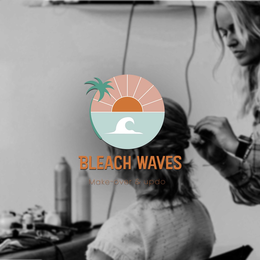
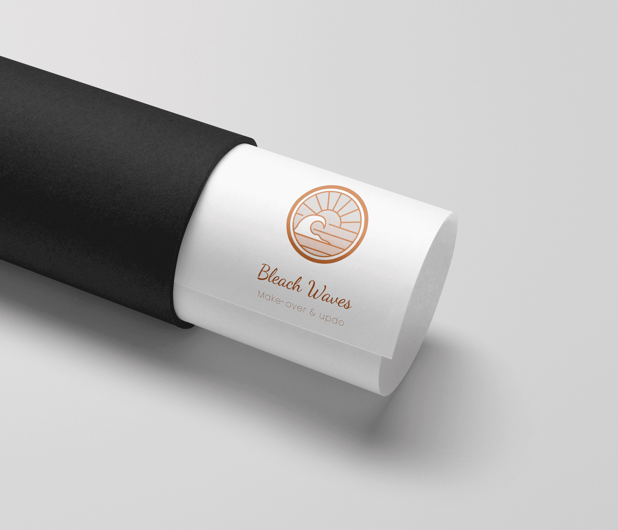
Before anything else, we sat down together to find a name that actually felt right. Something with a beach touch, a happy energy, and a clear connection to hair. That search led us to Bleachwaves. A name that referenced her craft, her aesthetic and the feeling she wanted her clients to walk away with. Once the name was there, everything else could follow.
The brief was clear: friendly, adventurous and positive. Nothing stiff or corporate. Something that would attract younger women looking for quality hair colour, balayage and bridal styling, and make them feel at home before they even walk through the door.
/
Solution
(02)
Three directions, one clear choice.
Before sketching a single logo, I started with a brand strategy. I worked through a detailed questionnaire with Steffi to map out her personality, her target audience, her values and the visual direction she had in mind. From there I put together a moodboard and a design rationale covering form, typography and colour. Soft earthy tones inspired by beach and summer. A mix of clean and handwritten type to balance professionalism with warmth. A logo mark that felt connected to the world of hair without being too on-the-nose.
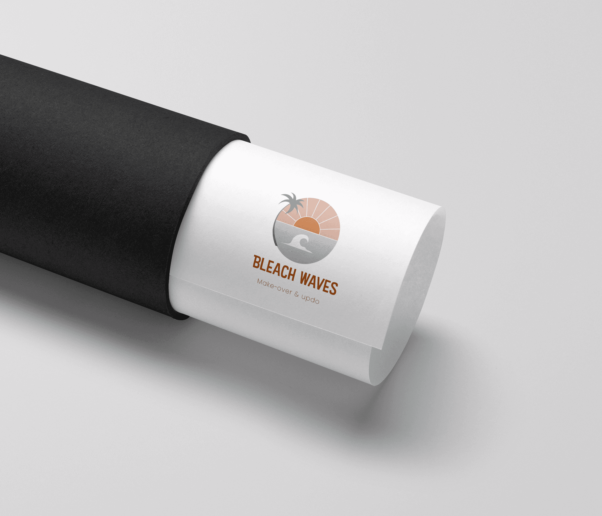
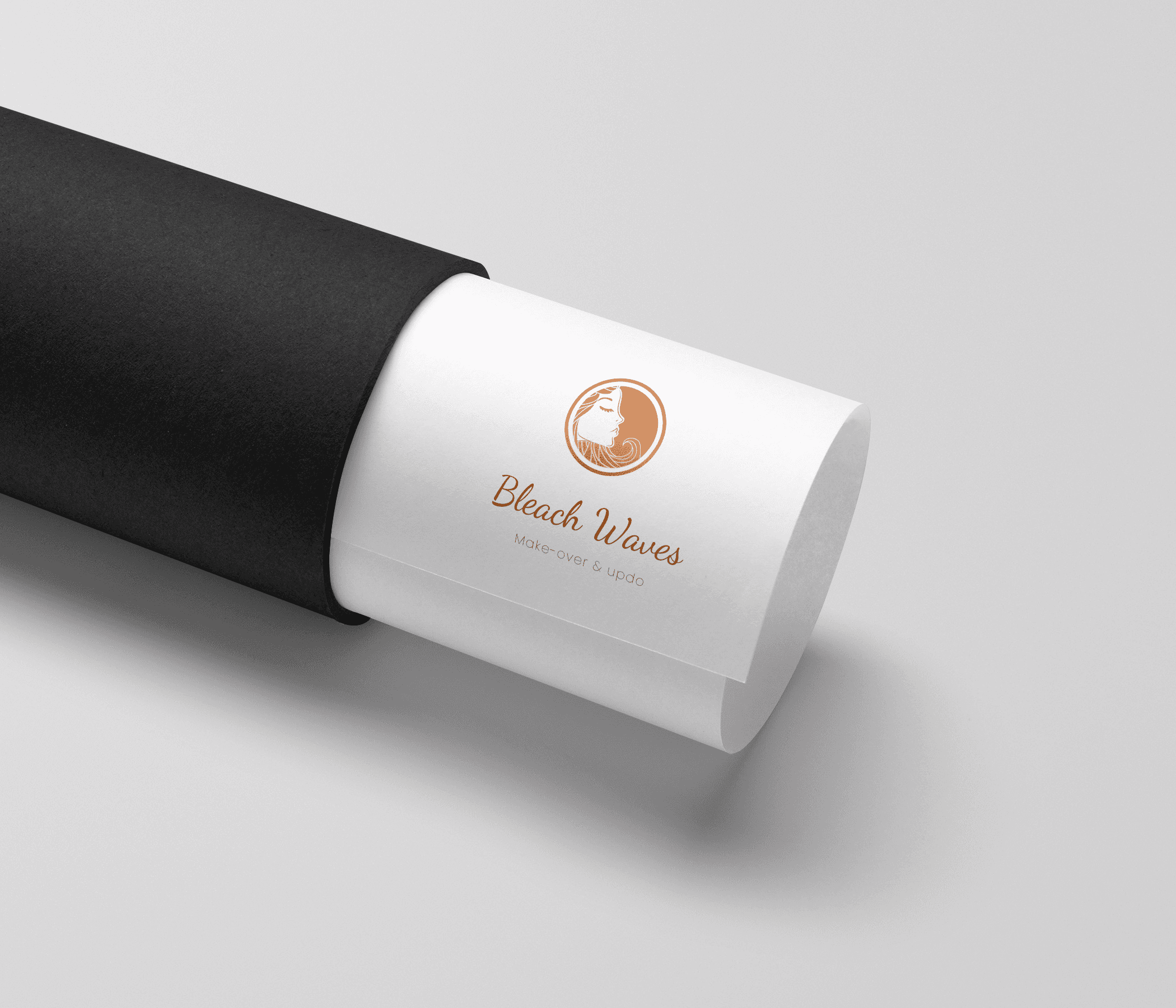
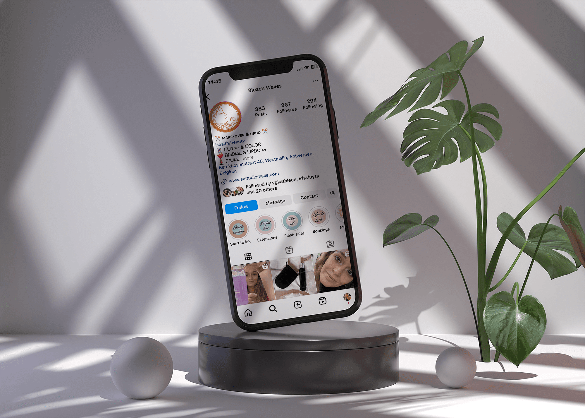
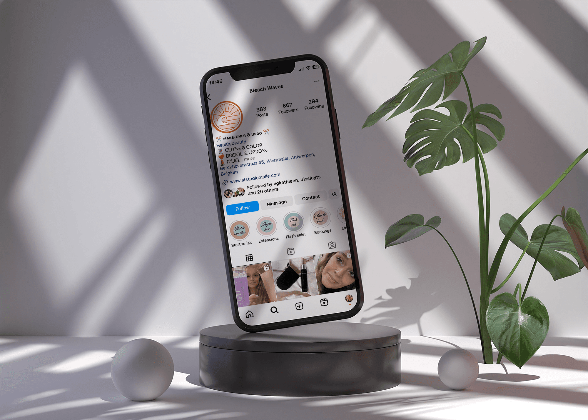
I developed three distinct logo concepts, each with its own visual direction. Steffi made her choice and the logo was refined into its final form. The typography and colours from the logo then became the foundation of her broader visual identity, which she applied herself across her website and social media. A simple approach, but it worked. Everything felt consistent because it all came from the same source.
/
Conclusion
(03)
A brand as polished as the work behind it.
This project is a good example of how far a well-considered logo can go. The budget was focused, the scope was tight, but because the thinking behind it was solid, Steffi had everything she needed to build a consistent brand on her own from there. She knew the feeling she wanted to create: happy, warm, a little bit of sunshine even on a grey day. My job was to translate that into something she could actually use. And she did.

Latest Projects.
© Ellevated
A curated selection of projects that reflect our commitment to simplicity and purposeful design.